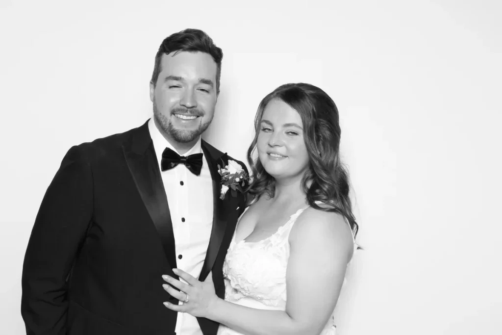
Strip away colour and a portrait has fewer places to hide. Expressions become more immediate. Dark formalwear gains definition, white clothing feels luminous, and the shape of every group matters. Rachel and Scott’s selected wedding photographs lean into that simplicity with a clean white background, a consistent black-and-white finish, and a mostly minimal approach to props.
A portrait-led monochrome wedding gallery
- Celebration
- Rachel and Scott’s wedding
- Background
- Clean white
- Finish
- Consistent black and white
- Portrait mix
- The couple, pairs, and wedding groups
- Styling
- Mostly minimal or prop-free
A quiet background puts every expression forward
The white background does not compete for attention. It leaves open space around Rachel and Scott in their portrait, then stays equally calm as more guests enter the frame. The black-and-white treatment simplifies the scene further, directing attention toward faces, clothing contrast, texture, and body language.
That restraint is what makes the gallery feel deliberate. The couple’s portrait is polished without being fussy. The background supplies consistency, while the people create the variation.
Formal clothing becomes part of the composition
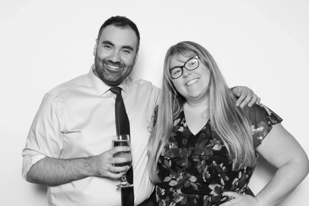
Monochrome changes how clothing reads. Dark suits create strong shapes against white. Pale fabrics feel brighter. Patterns become texture rather than competing colour. In the selected group photographs, those tonal differences help separate one person from the next even when everyone moves close together.
This is why black and white deserves to be considered as a complete visual direction, not simply a filter chosen at the last moment. Background colour, clothing, lighting, props, and group size all influence the final balance. Looking at real portraits with different combinations of those elements is more useful than judging the style from one carefully posed couple alone.
Groups bring energy without breaking the look
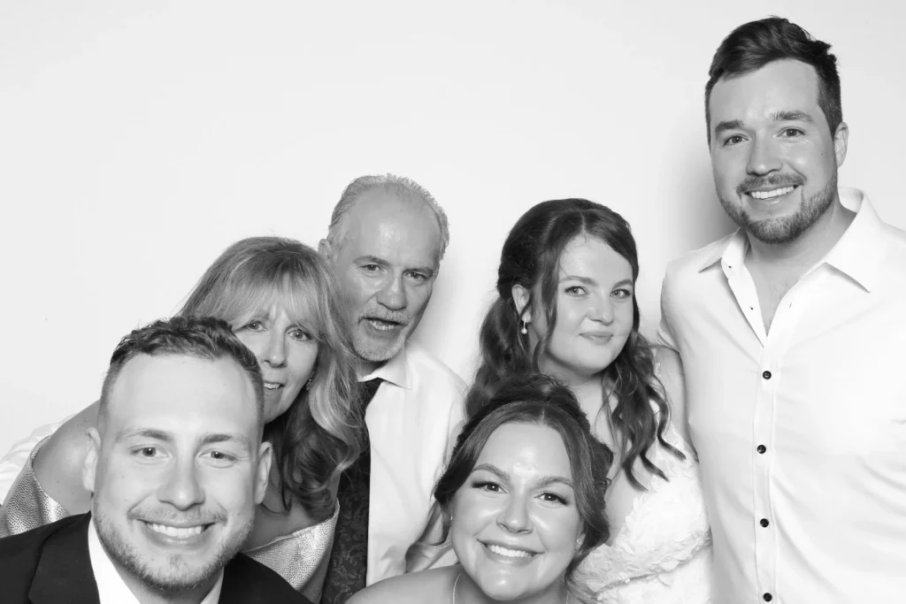
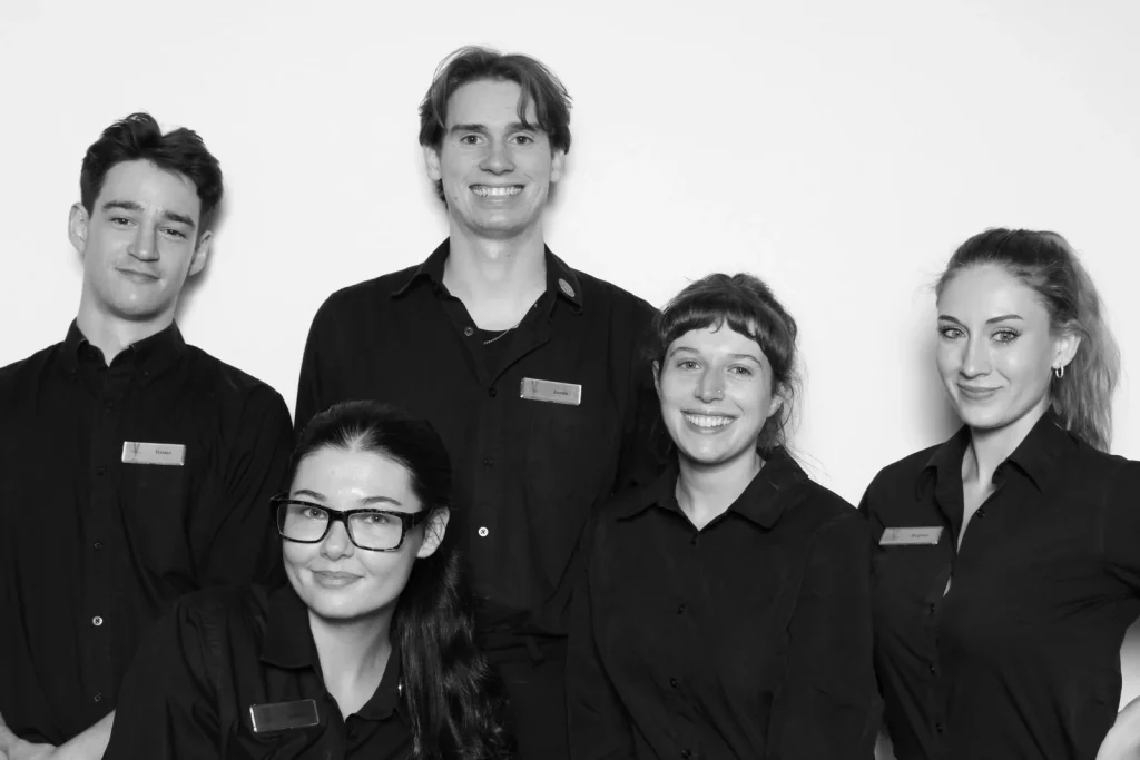
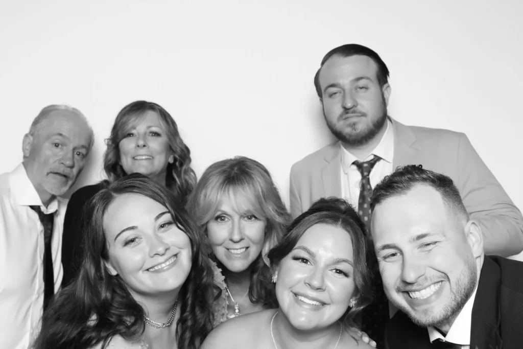
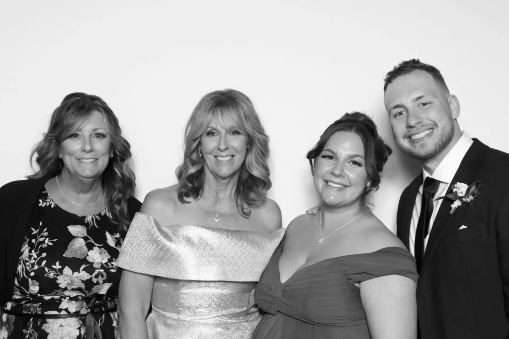
The approved photographs move from the couple to groups of different sizes. Five guests use a straightforward arrangement. Seven lean together and bring their faces closer to the camera. Four stand in a clean line, while a group of six gathers tightly enough to make the frame feel spontaneous. The compositions change, but the white field and monochrome finish hold them together.
For couples who care about group portraits, this consistency is a major part of the appeal. Guests do not have to repeat one pose for the gallery to look coherent. They can stand tall, lean in, or crowd the foreground; the portrait treatment does the connecting work.
Minimal styling leaves room for personality
Most of the selected images are minimal or prop-free. That does not make them severe. Smiles, closeness, and the way each group occupies the frame provide plenty of personality. Without a novelty piece in every hand, the viewer notices relationships first: the couple together, two guests side by side, and friends gathering shoulder to shoulder.
A minimal direction can also remove a small point of hesitation. Guests who do not want a prop can step in without feeling that something is missing. If a wedding calls for a few accessories, they can remain optional and visually restrained rather than defining every portrait.
Restraint does not mean asking every guest to look serious. It means giving expressions and relationships more space to carry the image. Laughter, a close embrace, or an unexpected group arrangement can still feel exuberant; the monochrome treatment simply gives those moments one consistent visual language.
When reviewing examples for your own wedding, look beyond the best couple portrait. Check how the style handles white clothing beside dark clothing, patterned fabrics, pairs at different heights, and a group that fills the frame. A direction that works across those situations is more likely to produce a gallery that feels complete.